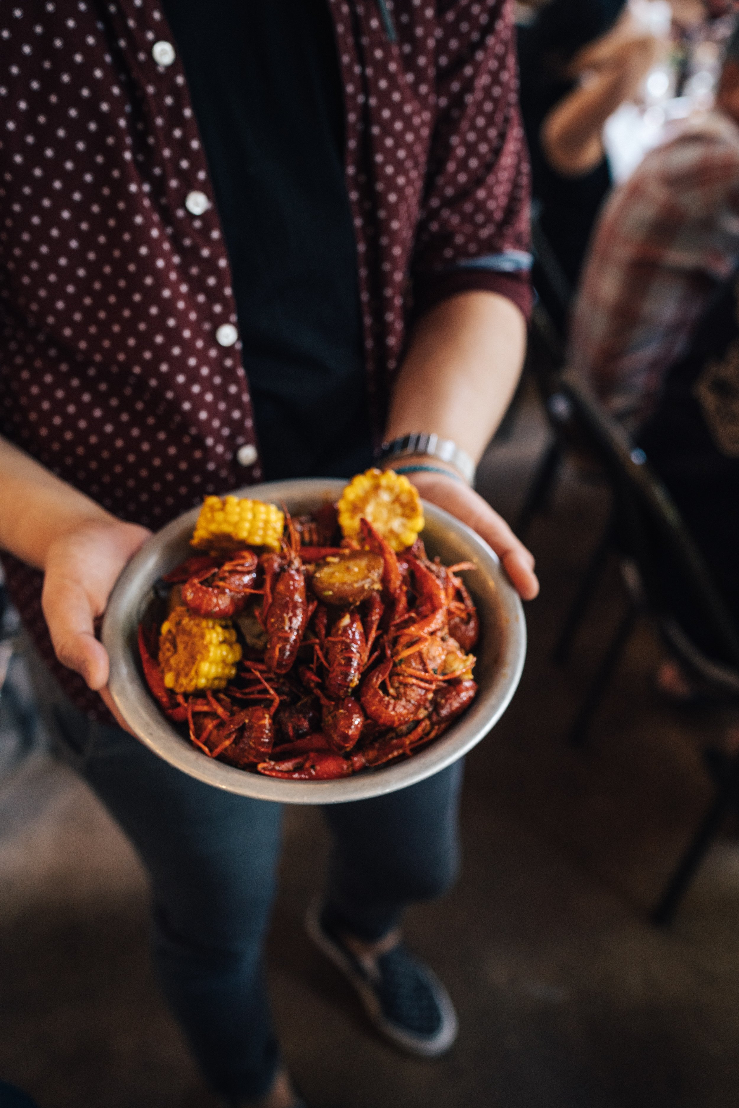
The Boiling Crab Menu
Case Study
Graphic Design & Page Layout
My goal was to find an existing, poorly constructed brochure, and reconstruct the layout, incorporating the design principles while still including the restaurant’s theme. The tri-fold I chose was The Boiling Crab menu given out to the customers. Aside from the food, the menu contains additional information: locations across America, business hours, website, social media handles, and different methods for payment.
Annotations
The problem with the existing trifold was that it contained several distractions which became too overwhelming for customers to read.
Outside:
The background contained extra textures and details that made the text illegible at first glance.
The icon images in the background were difficult to make up since they blended with the wood textures and beige colors.
The front cover of the trifold had no hierarchy. The white square was competing with the logo and the images were scaled too small making it hard to see the restaurant.
The side with all the locations across America was unnecessary since we can easily look up the locations. In addition, the phone numbers were illegible, due to the red text on a dark brown background.
The close-up photo of the shrimps did not look appeasing and was difficult to pick out the other ingredients that came with this dish.
Inside:
the logo competed with the image of the crab dish.
The type for the food options was in all-capital letters. It was placed over a red rectangle and the subheads over a black rectangle. This combination made the type difficult to read.
There was inconsistency with the background for the subheads.
Red strips were placed throughout the trifold which took the viewers’ attention from the main focus, the food.
Not enough information on the type of beverages available.
Solution Process
The first step, making a list of the necessary information a menu trifold needs to contain. This included: the restaurant name, logo, business hours, address, food and drink images, special dietary information, and of course, the food items. The next step was to place each item in a category between “restaurant” and “meals”. This helped keep the menu organized and consistent. Having the items to include, I then sketched numerous layout templates, keeping in mind the importance of a simple design and navigation. Having the design that worked best, it was time to open up Adobe InDesign and begin placing the content for the new trifold.
New Trifold
The layout of the trifold consisted of the outside and inside split into three sections.
The outside pertains to information about the restaurant and incorporates its theme with the help of images. On the opening side (farthest to the right) is placed an image of a crab and the title of the restaurant encircling the crab. The reason behind this was to imitate the logo of the restaurant in a realistic way. The middle section includes the address, phone number, business hours, logo, website, and social media platforms. The last section on the left contains an image of a fishing net to maintain the sea theme of the restaurant as well as the blue of the net aligns with the color of the background.
Moving to the inside of the trifold, the body layout was kept on the same sides as the previous trifold the only addition was adding images of their famous dishes to the menu. The image, in the middle section, was placed in this area to grab the viewer’s attention when opening the menu. The type elements included in the trifold were chosen to ease navigation, take less time to order, and more time to enjoy the food. The typeface for the menu is sans serif, an easy typeface to read. The subheads were all capitalized to distinguish the title from the body copy.
Back to the layout, the left side includes the steps required to order the main dish and the right side includes additional dishes and beverages. The item names are justified left and the price is justified right. Under certain food items, a small label is placed to inform the customers of availability or add-on information. An asterisk is also placed next to the items that require a warning label. The warning paragraph was scaled smaller and moved from the bottom of the menu to the left page under the “steps to order” section.
Outcome & Reflection
After the reconstruction, the menu became easier to read and navigate. There is a sense of hierarchy and order throughout the trifold. It contains the necessary information to guide the customer to their destination as well as incorporating the seafood experience with helpful images.
The takeaway from this project was figuring out what was not working in the trifold and deciding which items to include, and which were unnecessary. With a simple layout and adequate information, customers can pick their food with ease and spend extra time enjoying the food and restaurant.


